Contents
- 1 What is a Line Chart?
- 2 Importance of Line Charts in Binary Options
- 3 How to Read a Line Chart
- 4 Components of a Line Chart
- 5 Interpreting Line Charts for Market Analysis
- 6 Line Charts vs. Other Chart Types
- 7 Advanced Techniques with Line Charts
- 8 Common Mistakes When Using Line Charts
- 9 Frequently Asked Questions (FAQs) about Line Charts
What is a Line Chart?
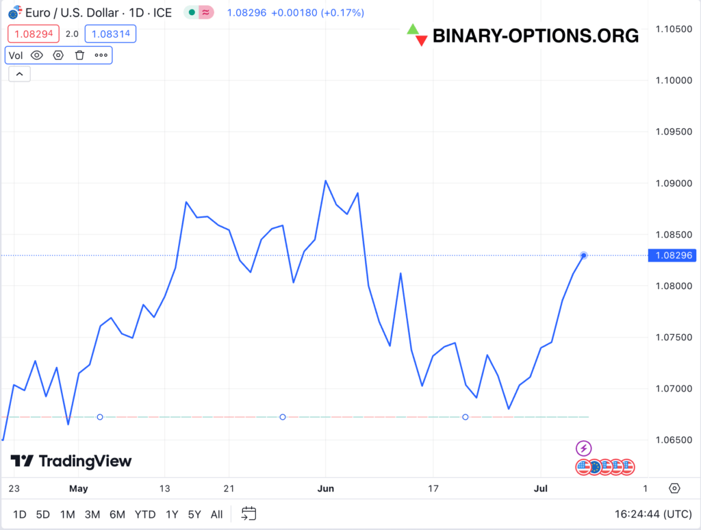
A line chart is a type of graph that displays information as a series of data points called ‘markers’ connected by straight line segments. It is commonly used in binary options trading to visualize price movements over a specified period on price charts. The simplicity and clarity of line charts make them an essential tool for both beginner and experienced traders.
Importance of Line Charts in Binary Options
Line charts are crucial in binary options trading because they are easy to read and interpret, provide a clear view of price trends and market movements, and aid traders in making informed decisions by highlighting trends and patterns.
How to Read a Line Chart
To read a line chart, you need to understand its key components:
- Time Axis (X-Axis): Represents the period over which the data is collected. This could range from minutes to months, depending on your analysis needs.
- Price Axis (Y-Axis): Displays the price levels at different points in time.
- Data Points: Each point represents the closing price at a specific time.
- Connecting Lines: These lines connect data points and show the direction of price movements.
Components of a Line Chart
Time Axis (X-Axis)
The time axis (X-axis) on a line chart represents the period over which the data is collected. This could range from minutes to months, depending on the trader’s analysis needs.
Price Axis (Y-Axis)
The price axis (Y-axis) displays the price levels at different points in time. This axis helps traders understand how the price has moved over the selected period.
Data Points and Lines
Data points are individual markers that represent the closing prices at specific times. The lines connecting these data points show the trend and direction of price movements.
Volume Indicators
Volume indicators can be added to line charts to show the trading volume, which helps traders understand the strength behind price movements.
Setting Up Line Charts on Trading Platforms
Choosing the Right Trading Platform
Selecting a reliable trading platform is crucial for effective line chart analysis. Look for platforms that offer robust charting tools, real-time data, and user-friendly interfaces.
Customizing Line Chart Settings
Customize your line chart settings by adjusting the time frame, colors, and indicators to match your trading strategy and preferences.
Adding Indicators to Line Charts
Enhance your line chart analysis by adding technical indicators such as moving averages, Bollinger Bands, and Relative Strength Index (RSI) to gain deeper insights into price movements.
Saving and Exporting Line Chart Data
Many trading platforms allow you to save and export your line chart data for further analysis or record-keeping. This feature is useful for tracking your trading performance over time.
Interpreting Line Charts for Market Analysis
Interpreting line charts is a fundamental skill in market analysis that can significantly enhance a trader’s ability to make informed decisions. By understanding how to identify trends, spot support and resistance levels, recognize patterns, and predict price movements, traders can gain valuable insights into market behavior.
Identifying Trends
Trends are the general direction in which the price of an asset is moving. Trends can be upward (bullish), downward (bearish), or sideways (neutral).
Upward Trend (Bullish): This occurs when prices are consistently moving higher. A series of higher highs and higher lows characterizes an upward trend.
Example: If the price of a stock moves from $50 to $55, then to $53, then to $58, and back to $55, it demonstrates an upward trend with higher highs and higher lows.
Downward Trend (Bearish): This occurs when prices are consistently moving lower. A series of lower highs and lower lows characterizes a downward trend.
Example: If the price of a stock drops from $50 to $45, then to $48, then to $42, and back to $45, it demonstrates a downward trend with lower highs and lower lows.
Sideways Trend (Neutral): This occurs when prices move within a horizontal range, indicating no clear direction. The highs and lows remain relatively constant.
Example: If a stock price fluctuates between $50 and $55 for several weeks, it is in a sideways trend.
Spotting Support and Resistance Levels
Support and Resistance Levels are key price points where the market tends to reverse its direction.
Support Level: This is a price level where a downtrend can be expected to pause due to a concentration of buying interest. When an asset’s price falls to a support level, it tends to stop falling and may even rebound.
Example: If a stock has repeatedly fallen to $100 and then rebounded, $100 is a support level. Traders might place buy orders around this price, anticipating that the price will rise again.
Resistance Level: This is a price level where an uptrend can be expected to pause due to a concentration of selling interest. When an asset’s price rises to a resistance level, it tends to stop rising and may even fall.
Example: If a stock has repeatedly risen to $150 and then declined, $150 is a resistance level. Traders might place sell orders around this price, anticipating that the price will fall again.
Recognizing Patterns
Chart Patterns are formations created by the price movements on a chart and can indicate potential future price movements.
Head and Shoulders: This pattern indicates a potential reversal. It consists of three peaks: a higher peak (head) between two lower peaks (shoulders).
Example: If a stock price rises to $100, drops to $95, rises to $110, drops to $95, and rises to $100 before falling again, this forms a head and shoulders pattern, suggesting a future downtrend.
Double Tops and Bottoms: These patterns indicate a potential reversal. A double top is formed after two peaks at roughly the same level, while a double bottom is formed after two troughs.
Example: If a stock price rises to $120, drops to $110, rises again to $120, and then declines, it forms a double top, suggesting a future downtrend. Conversely, if the price drops to $80, rises to $90, drops again to $80, and then rises, it forms a double bottom, suggesting a future uptrend.
Triangles: These patterns indicate a period of consolidation before the price continues in the direction of the existing trend. There are ascending, descending, and symmetrical triangles.
Example: An ascending triangle forms when a stock price rises to a resistance level while the lows are getting progressively higher. This suggests a potential breakout above the resistance level.
Predicting Price Movements
By analyzing past price movements, traders can make educated predictions about future price movements.
Moving Averages: A moving average smooths out price data to identify the direction of the trend. Common types include the simple moving average (SMA) and the exponential moving average (EMA).
Example: If a 50-day SMA crosses above a 200-day SMA, it forms a “golden cross,” indicating a potential upward price movement.
Relative Strength Index (RSI): This momentum oscillator measures the speed and change of price movements. RSI values above 70 indicate overbought conditions, while values below 30 indicate oversold conditions.
Example: If a stock’s RSI rises above 70, it might be overbought, suggesting a potential price decline. Conversely, if the RSI falls below 30, the stock might be oversold, suggesting a potential price increase.
Bollinger Bands: These bands consist of a middle band (SMA) and two outer bands representing standard deviations. They help determine whether prices are high or low on a relative basis.
Example: If a stock price touches the upper Bollinger Band, it might be overbought, suggesting a potential price decline. If it touches the lower band, it might be oversold, suggesting a potential price increase.
Practical Example
Imagine a trader analyzing the price movements of XYZ Corporation stock over six months using a line chart. The trader observes the following:
- Identifying Trends: The stock shows a clear upward trend with higher highs and higher lows from $50 to $75.
- Spotting Support and Resistance Levels: The stock repeatedly finds support at $60 and faces resistance at $70.
- Recognizing Patterns: A double bottom pattern forms at $60, indicating a potential uptrend.
- Predicting Price Movements: The trader notices a golden cross with the 50-day SMA crossing above the 200-day SMA, suggesting a bullish future. The RSI is around 65, not yet overbought, indicating the uptrend might continue.
Using this analysis, the trader decides to place a long position, anticipating further price increases based on the identified trends, support and resistance levels, recognized patterns, and predictive indicators.
Line Charts vs. Other Chart Types
Understanding the strengths and weaknesses of different chart types is crucial for effective market analysis. Here, we will compare line charts with candlestick charts and bar charts, highlighting their respective features and uses.
Line Charts vs. Candlestick Charts
Line Charts:
- Simplicity: Line charts are straightforward, displaying a single line that represents the closing prices over a period. This simplicity makes them easy to read and ideal for quickly identifying overall trends.
- Minimal Detail: They only show closing prices, which can be a limitation if you need detailed information about price movements within each period.
Candlestick Charts:
- Detailed Information: Candlestick charts provide a comprehensive view of price movements within a specific period. Each candlestick shows the opening, closing, high, and low prices.
- Visual Clarity: The body of the candlestick (the area between the opening and closing prices) is shaded to indicate price direction: green or white for an upward movement (closing price higher than opening) and red or black for a downward movement (closing price lower than opening).
- Pattern Recognition: Candlestick charts are particularly useful for recognizing patterns that signal potential market reversals or continuations. Common patterns include Doji, Hammer, and Engulfing patterns.
- Example: A trader might use a candlestick chart to identify a bullish engulfing pattern, where a small red candlestick is followed by a large green candlestick, indicating a potential upward reversal.
Practical Comparison:
- Use Case: Line charts are excellent for getting a quick sense of the overall trend, while candlestick charts are better suited for in-depth analysis and short-term trading strategies due to their detailed nature.
- Example: For a long-term investment strategy, a trader might use line charts to identify general market trends and switch to candlestick charts to pinpoint entry and exit points based on detailed price action.
Line Charts vs. Bar Charts
Line Charts:
- Simplicity: As mentioned, line charts provide a straightforward representation of the closing prices, making them easy to interpret and use for identifying general trends.
- Limited Detail: They do not show the range of price movements within each period, missing out on information about opening, high, and low prices.
Bar Charts:
- Detailed Information: Bar charts provide detailed information about price movements within each period. Each bar represents the opening, closing, high, and low prices.
- Structure: A bar consists of a vertical line indicating the price range for the period, with horizontal lines on the left and right sides representing the opening and closing prices, respectively.
- Trend Analysis: Bar charts can help traders identify trends and volatility within each period. The length of the bar indicates the range of price movement, providing insight into market volatility.
- Example: A long bar with a wide range might indicate high volatility, while a short bar suggests stability.
Practical Comparison:
- Use Case: Line charts are best for visualizing long-term trends and simplifying analysis, while bar charts offer a more detailed view of price action, suitable for identifying short-term trading opportunities and understanding market volatility.
- Example: A trader might use line charts to determine the overall direction of a stock over a year and switch to bar charts to analyze daily price movements and volatility before making a trade.
Summary
- Line Charts: Best for a quick, high-level view of market trends. They are simple and easy to read but lack detailed price information.
- Candlestick Charts: Provide detailed insights into price movements within each period, useful for identifying market patterns and making short-term trading decisions.
- Bar Charts: Offer a detailed view of price fluctuations within each period, useful for understanding market volatility and short-term trend analysis.
Advanced Techniques with Line Charts
Combining Line Charts with Technical Indicators
Enhance your analysis by combining line charts with technical indicators to gain a comprehensive view of the market.
Overlaying Multiple Line Charts for Comparison
Overlay multiple line charts to compare the performance of different assets or to analyze the same asset over different time frames.
Using Line Charts for Long-term vs. Short-term Analysis
Adapt your line chart analysis techniques for long-term investments versus short-term trading strategies to maximize your trading outcomes.
Common Mistakes When Using Line Charts
Over-reliance on Historical Data
Avoid the mistake of over-relying on historical data. While past performance can indicate future trends, it’s not always a guarantee.
Misinterpreting Minor Fluctuations
Don’t misinterpret minor fluctuations as major trends. Focus on significant price movements to make more accurate trading decisions.
Ignoring Volume Data
Ignoring volume data can lead to incorrect conclusions. Volume indicates the strength of a price movement and should be considered in your analysis.
Failing to Use Line Charts in Conjunction with Other Analysis Tools
Line charts should be used alongside other analysis tools and techniques to create a well-rounded trading strategy.
Frequently Asked Questions (FAQs) about Line Charts
What are the key benefits of using line charts in binary options trading?
Line charts are simple, easy to read, and effective for identifying trends and making informed trading decisions.
How do I choose the right time frame for my line chart?
The right time frame depends on your trading strategy. Short-term traders may prefer shorter time frames, while long-term investors might opt for longer periods.
Can line charts be used for short-term binary options trading?
Yes, line charts can be used for short-term trading, but they should be complemented with other analysis tools for better accuracy.
What are the most common indicators used with line charts?
Common indicators include moving averages, Bollinger Bands, Relative Strength Index (RSI), and volume indicators.
Further reading: